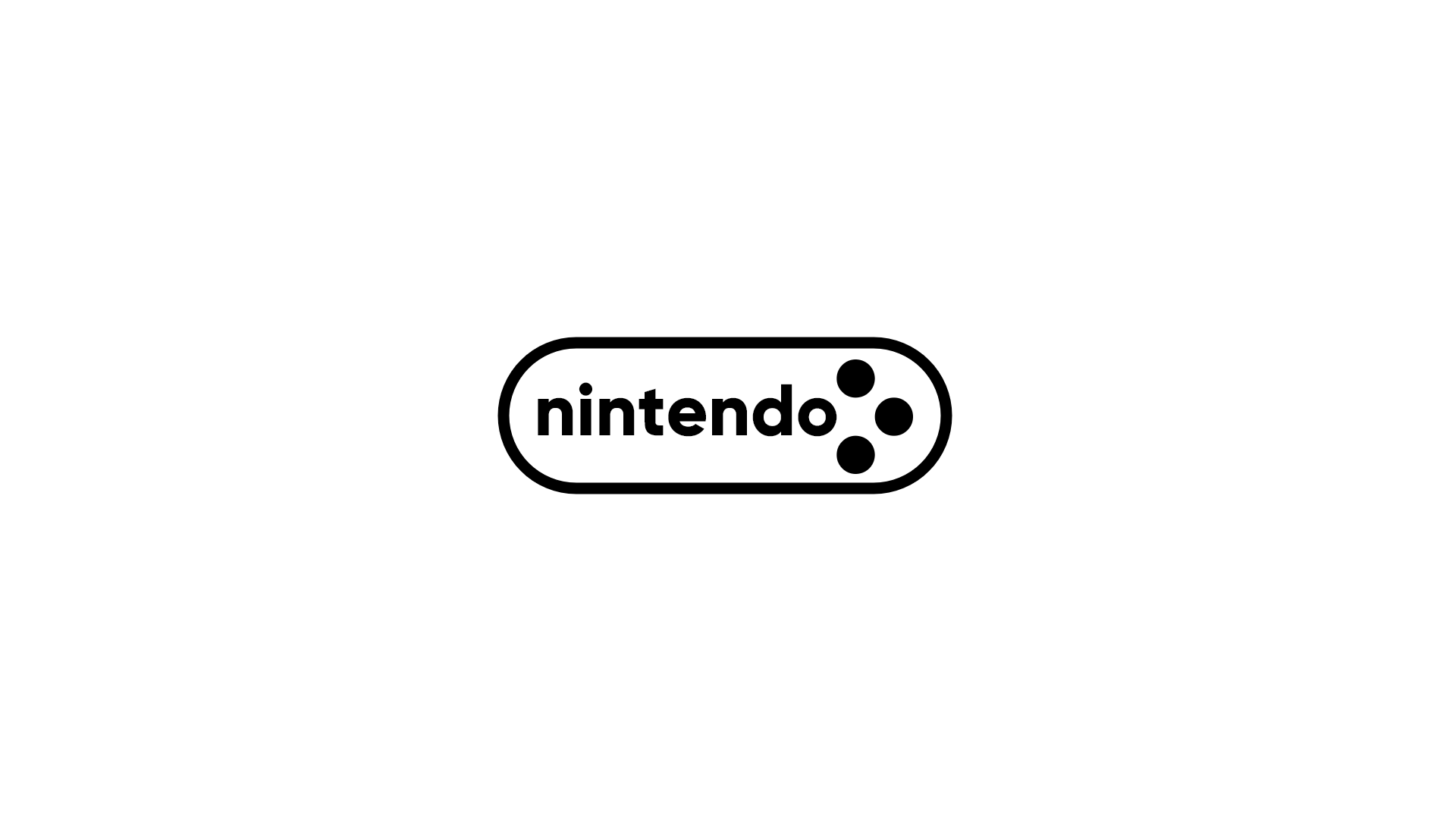
Nintendo Rebrand
Redesigned Nintendo’s logomark.
Client: Personal project
Deliverables: Logomark
Timeline: 2 days
Tools: Sketch
I used a bold, blocky typeface similar to the one seen in Nintendo’s ancillary brands and marketing services, and combined it with a motif that evokes the classic buttons on the Super Famicom controller. I kept the oval border from the original logo but made it larger to reinforce the controller motif.


